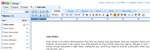
 Today, ZOHO announced the launch of a new major version of its word processor - Zoho Writer 2.0 - with a fresh and elegant user interface & significant improvements. This important upgrade comes with hundreds of improvements, mostly on the user interface.
While there are many changes in the interface, the core frame remains the same with document listing on the left, editor on the right, the ability to open multiple documents as tabs etc. But then, every part of the interface is now enhanced.
Note: When you open the new version, it is highly recommended that you to do a SHIFT+Refresh to make sure the app works well.
The new 'MenuTab Interface'
In previous version, Zoho Writer's core functionality was available as links and buttons in three rows. As features grew over the past three years, the number of buttons increased which made it difficult in finding the right button.

The toolbar was redesigned completely and introduced a new interface called as 'MenuTab' interface. At the high level, this MenuTab interface categorizes the features as tabs based on functionality. You'll notice tabs for 'Format', 'Insert', 'Review' etc. But the key here is the ability to use these tabs as Menus. If you are used to using Menu's in traditional software, you'll feel right at home. If you are used to using Tabbed interface you find in many web applications, again, you'll feel very comfortable. 
This MenuTab interface also allows enough space to explicitly mention what each button does - both under the tab as well as under Menus. This was not the case in previous design where you had to rely on tool tips.
You'll also notice that the commonly used features like Save, Undo/Redo, Cut/Copy/Paste etc are grouped together beside the MenuTabs so that you have access to these always.
Additional details on MenuTab are available here.
Sidebar Enhancements
The sidebar for Zoho Writer was also improved significantly. You'll notice that this new sidebar will now be consistent with the sidebar of Zoho Sheet. The new sidebar has features to multi-select documents and perform actions. The icons beside the document name shows if the document is shared or public.
Search is also included in the side bar and enhanced the overall functionality.
There were several other enhancements to the application in Header/Footers, Page Views, Collaborative Editing (available at bottom right corner), inclusion of Word and Character count in status bar, improved page layout etc.
Here is a screenshot tour of Writer 2.0
check this announcement for more details.


No comments:
Post a Comment