![]() You might have noticed the new look for FriendFeed. FriendFeed team was tinkering with a new design for a few weeks, and after spending some time in beta, it's finally ready for primetime.
You might have noticed the new look for FriendFeed. FriendFeed team was tinkering with a new design for a few weeks, and after spending some time in beta, it's finally ready for primetime.
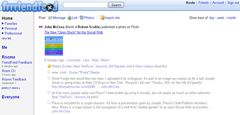
The new design offers friend lists to help you organize your subscriptions into groups. Now you can get updates from specific groups of people separately, or you can add an acquaintance to a list and remove them from your home feed.

There are lots of other improvements, such as being able to post photos directly to FriendFeed. A sidebar is added to improve navigation, making it easy for you to access your Friend lists and customize the Rooms you want to visit most often.
Finally, because everyone's FriendFeed experience is unique, new design added a way to view FriendFeed the way someone else does, with their feed and entries from all their subscriptions. You can use this feature by simply clicking the "[name] + Friends" tab on a person's profile page. For example, here's my FriendFeed. And here's Paul's.
FriendFeed also launched most-requested features: duplicate detection.
When a popular story breaks, like the news about Wall Street this week, lots of people tend to share the same article. With this new noise-reducing FriendFeed feature, when multiple friends share the same link, the set of duplicate entries will only show up once in your feed:


No comments:
Post a Comment